
Mobile games can now be been seen across desktop, Nintendo Switch, and other top consoles. So when keeping all of these devices in mind, how can you make your game’s UI work across them all?
Editor’s note: This post was originally published by Sarah Impey, Content Marketing Manager at GameAnalytics. With several years of experience digging into industry trends, Sarah knows how to boil down complicated topics into key insights.
Mobile gaming continues to outpace both PC and console segments in the global games market, and now represents over half (51 per cent) of the total market share, according to Newzoo.
And in today’s market, developers are no longer making a game for just one device. Mobile games in particular can now be been seen on desktop, Nintendo Switch, and other top consoles. So when keeping all of these unique devices in mind, how can you make sure your game’s UI works across them all?
Psst! This post is slightly longer than usual, so you can jump to something in particular, if you want:
- Keeping it simple – difference in space and layout
- Choose your controls well – buttons vs. HUDs
- When to turn up the graphics – quality control
- UI checklist: testing your interface
- Top takeaways: everything summed up
Key difference #1: Space & layout
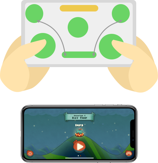
On mobile, you don’t have a keyboard to play around with. You have less than three inches of glass. And instead of keyboards, joysticks, a mouse or controller, you have two thumbs.
So yes, you’re limited, but that doesn’t make it impossible. You just need to be a little creative..
Firstly, less is more; only convey the essentials
Your challenge is separating the essentials from the nice-to-haves. You need to clearly organise your menus, your buttons and all your other visuals.
While desktop games have similar challenges when it comes to delivering smooth, uncluttered gameplay, they benefit from a bigger screen. Which means, developers can build in various displays, menus, bars and game-related info without getting in the way of the core gameplay.
Blizzard is a great example of how games can be optimized across all devices. Hearthstone, originally released on PC and tablet in 2014, did a great job in keeping the gameplay almost identical. As you can see below, simply changing the layout of the menu screen was all they needed to do for mobile. They’ve kept the main menu in the same place, zoomed in on the chest, and moved the harder to reach buttons to where people’s thumbs naturally hover.
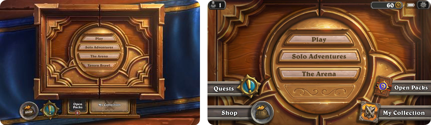
The reason it works is because when originally creating the Hearthstone game, they created it for both PC and tablet. If, when you’re designing, you think about how it’s going to look – right from the beginning – then you’re probably going to make life much easier for yourself in the future. They didn’t need to compromise. They were already designing for mobile and PC at the same time.
Orientation plays a role here too
Some mobile game titles will offer dual functionality between portrait and landscape, while others are limited to only one. Each has its benefits – and all users have their preferences – so there’s no hard and fast rule here.
Portrait Orientation
Landscape Orientation
Green = easy to access, yellow = trickier, red = hard.
With portrait games, developers are tasked with designing games that are playable with one hand only. This may be fine with idle games, or even most hyper-casual titles. But for more hardcore titles, where you have multiple commands and actions, landscape makes it much easier. With two thumbs, you’ve got twice as much choice. (And much more of the screen people can tap.)
Moving from mobile to desktop?
If you originally built your game for mobile, and are now thinking about moving to desktop or console, consider yourself lucky. Taking your game from desktop to mobile is hard, moving from mobile to PC or console is considerably easier.
Look at Fallout Shelter’s grid-style layout for example. The title already has simple controls on mobile, so it’s a cinch to make it work with a mouse.
Video source: Fallout Shelter PC – Ep. 1 – Fallout Shelter Vault #314 by Blitz
To move around, you just click and hold, or use the classic WASD. And to zoom, you can just scroll. On this occasion, the only real difference between these games is the extra room you have on desktop to see everything in more detail.
Key difference #2: Practical buttons vs. sophisticated HUDs
Desktop games can have a lot on the screen at once. Mobile can’t.
A rough idea of the controls you’re working with.
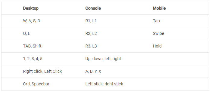
Console has roughly 16, dependent on the console type. And then you’re left with 3 for mobile – which is quite a difference.If we use the above grid as a guide, then you’ll know that with desktop, you have at least 17 different actions (although you have the entire keyboard to play with, if your players have the muscle memory to use them all).
Design your buttons well
When designing your on-screen buttons, ‘less is more’ is normally what developers lean towards. Restricted controls and lack of room are the obvious challenges, so simplifying your game tends to be best. However, this isn’t always the case if your game demands a ton of controls mixed with complex gameplay.
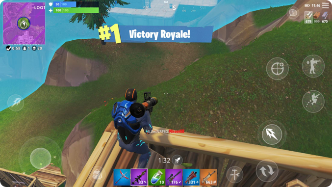
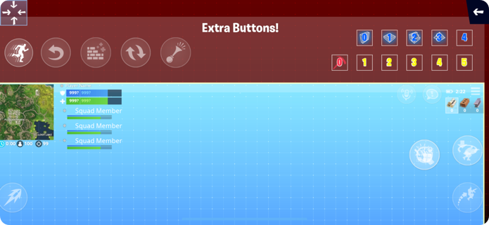
Fortnite is notorious for having lots of buttons for their game, being originally a PC and console title. However, they’ve done well to take these complex controls and apply them to mobile. At times, you can have over 9 buttons to press on your screen, which could be considered a mobile developers nightmare.
To overcome the issue of having tons of buttons on the screen and blocking space, they actually made the buttons semi-transparent. This allows players to have access to multiple buttons, without limiting their view of the game.
Consider the actual design of your buttons carefully. If you only have a couple, making them noticeable could benefit you. But if you have loads that you need to fit on one small screen, you may find larger more transparent versions is the way to go.
Cheat: Let the players do the designing
Another useful trick to overcome complex controls is to let players move the buttons around for themselves. That’s exactly what Fortnite does. Not only do they have extremely clear instructions at the beginning of the game and in their menu, but they let you pick which actions you want on screen and where they’ll be.
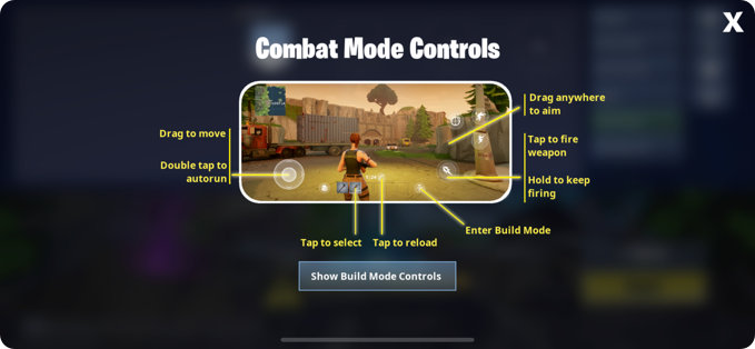
And as this is a live game, this is crucial to making every second count when competing against other players. They can have their buttons where they want, and make it consistent across all their devices. Will it ever really make a mobile user as accurate as a mouse and keyboard? Probably not. But it evens the playing field quite a bit.
Key difference #3: Image quality
Yes, smartphones are now more powerful than the computers that man put on the moon. But they just don’t have the processing power of a gaming rig.
And so yes, there’s a gap here, but it’s not necessarily one that mobile gamers are crying out to rectify. Some would even argue that they prefer lower graphic quality, as to save battery and experience more gameplay.
Know when to reduce image quality…
Let’s take a look at Elder Scrolls: Blades, a close relative of the hugely popular series for console and desktop. Although the graphics are simply incredible for a mobile game, we can see that image quality doesn’t exactly match up to the kind of graphics Elder Scrolls fans might be used to on console.
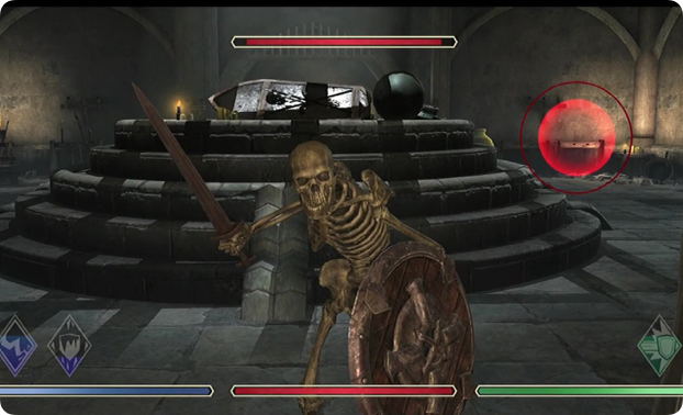
If Bethesda did consider moving Elder Scrolls Blades to desktop, they would probably need to up the graphics to the same standard as their other games. However, at the moment, this is purely a mobile game. And being that it is such a large open world game with a ton of content, it would be a battery draining disaster if they made the graphics any better.
But, if you are moving to PC, remember that it’s a chance to improve on what you have. It doesn’t need to be a direct port.
…and know when to keep it
Reduced image quality is arguably a fair trade off when you’re offering access to fast-paced, snack-sized titles that are often free to play – all available in your pocket. However, if your players are used to a high quality, pristine desktop version of your game, it may actually be better to maintain that quality in your mobile version.
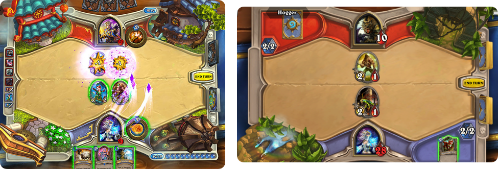
And Hearthstone is a fantastic example of this.
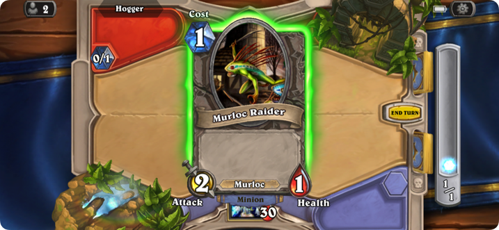
During the gameplay, the developers have done a brilliant job in making you feel as though you are actually playing cards on a table. For their mobile version, Blizzard actually decided to keep the card game 3D and kept their high quality graphics and animations – despite the issue of draining battery life and taking up storage space (3.07gb).
Players will most likely play this game across different platforms, rather than one dedicated one, so it’s important for Blizzard to keep the standard consistent. And yes, this does sacrifice that all important battery life. But they’ve actually kept the battery icon visible throughout gameplay, letting players know if they need to run for a charger during their live games.
Testing your interface (your UI checklist)
When you’re testing your interface, there are four key areas to keep in mind. So check:
Does it feel immersive?
- Are you using color, sound and vibrations to make it feel like they’re in the world?
- Could you use more?
Is it consistent?
- Is the design and placement of your buttons consistent across different devices?
- Do they need to be consistent? Does it interrupt gameplay if they are?
Is it simple?
- Do your labels make sense to a newcomer?
- Does it feel cluttered? Is there anything you could strip away?
Does it function well?
- Are they easy to click?
- Can they be found quickly? If not, how can you overcome this?
These are hard questions, when you’re close to a project. So get a friend, and ask if they mind playing through the game. Sit behind them and take notes. You can ask a few of these questions, but try not to prompt them and ‘cheat’ for them. If you need to point them in the right direction, your design needs a tweak.
We’ve actually discussed a similar topic to this, which is: How to make your game UI shine and increase conversions. Make sure to check it out and nail your UI!

Top Takeaways…
There is no singular path in nailing your game’s UI, and as seen throughout this post, your UI really depends on the type of game and genre you have. Once you’ve figured this out, all of the details and design can be ironed out.
However, when you do consider taking your game cross platform, remember to follow these steps:
1. Figure out what layout is best for you
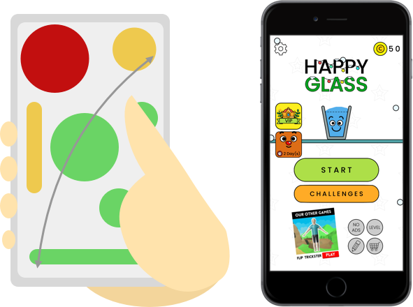
- Whether you have a simple game like Happy Glass, or a fast paced complex one like Fortnite, always consider the type of game you have. Make sure you know how the layout will complement this.
2. Treat your buttons well
- Loads of buttons? Then you may have to be creative with how you present them. Consider the position of your controls as well, so they don’t interrupt that important gameplay.
3. Quality control – know what type of graphics you can afford
- Small game = you can afford high graphics.
- Big game however… well you may have an amazing huge open world game on your hands that your audience can’t wait to dig their fingers into. Having high graphics here might drain their battery and make the game even bigger, so consider what you can afford to have.
4. Keep it consistent
- Lastly, if your game is available across multiple devices, it might be good to keep everything as consistent as possible. This is to avoid disappointing your loyal players.