In my early career, I worked for some time making Art for slot games for the One Armed Bandit machines. Clients required flashy graphics with gold and glitters everywhere, and color gradients so vivid, I had to put cucumber slices on my eyes, every EOD. Deviating from such extravagantly bright and showy graphics would be a wrong artistic choice because the games have to be eye-catching to attract customers.
Editor’s Note: This post was originally published by Kshiraj Telang at gameartanalysis.com. Kshiraj is a Studio Art Director at Rovio Entertainment Corporation. Disclaimer: The assumptions and opinions expressed in this article belong solely to the author, and do not necessarily reflect the actual thought process or research followed by the developer.
Fast forward to today, Moon Active’s Coin Master (a social build-battler mobile game employing slot mechanics), with it’s accessible Art style, appeals and delivers to a wide casual audience, making the game the Big Bertha of this genre. Relaxing like a beautifully illustrated storybook, Coin Master’s Art plays a big role in broadening the funnel, increasing the retention, and making the gameplay enjoyable.
Theme
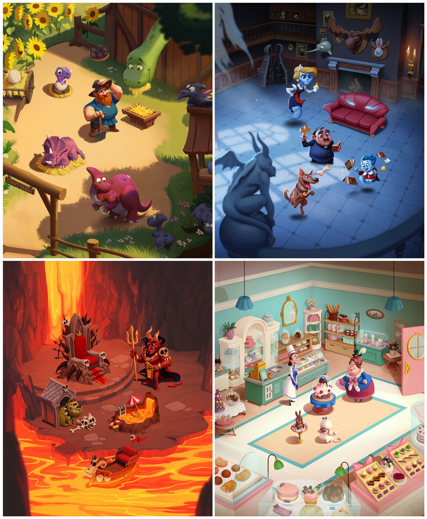
The theme world of Coin Master is broad and loose. It works for them too, making the game scaleable to thematically different villages. While the Art style stays consistent across the villages (for the right reasons), the changing themes, as you progress in the game, gives you the experience of switching between different worlds, themed from Supervillains to Jurassic Park to Aliens and what not. Though the gameplay stays the same, the progression reskins the main game board, some reel symbols, and the village you build.
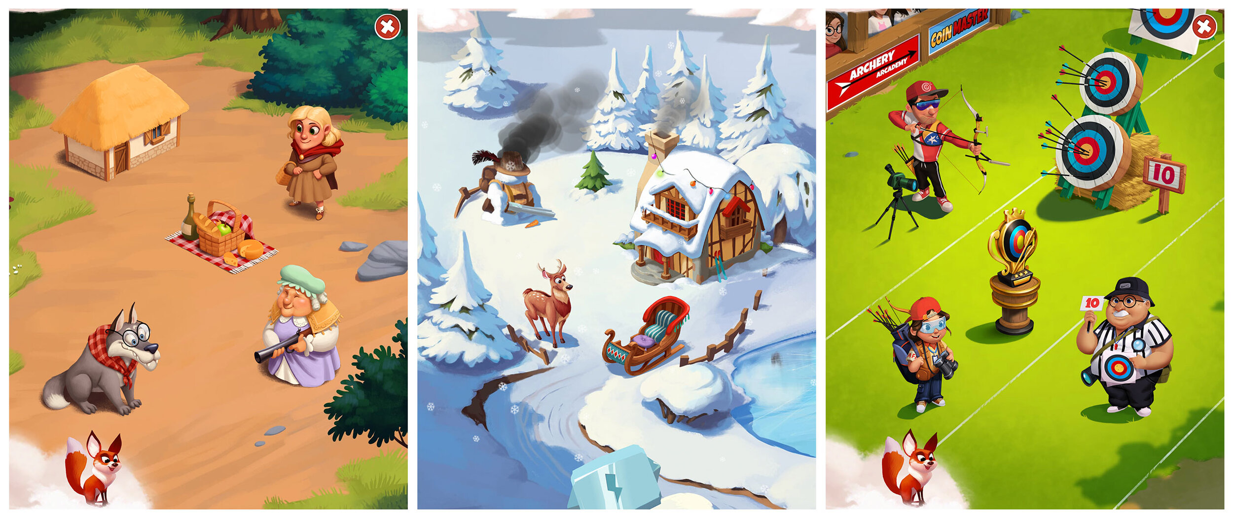
Each village usually has 1-2 characters, humans or animals, alongside some building and decorations
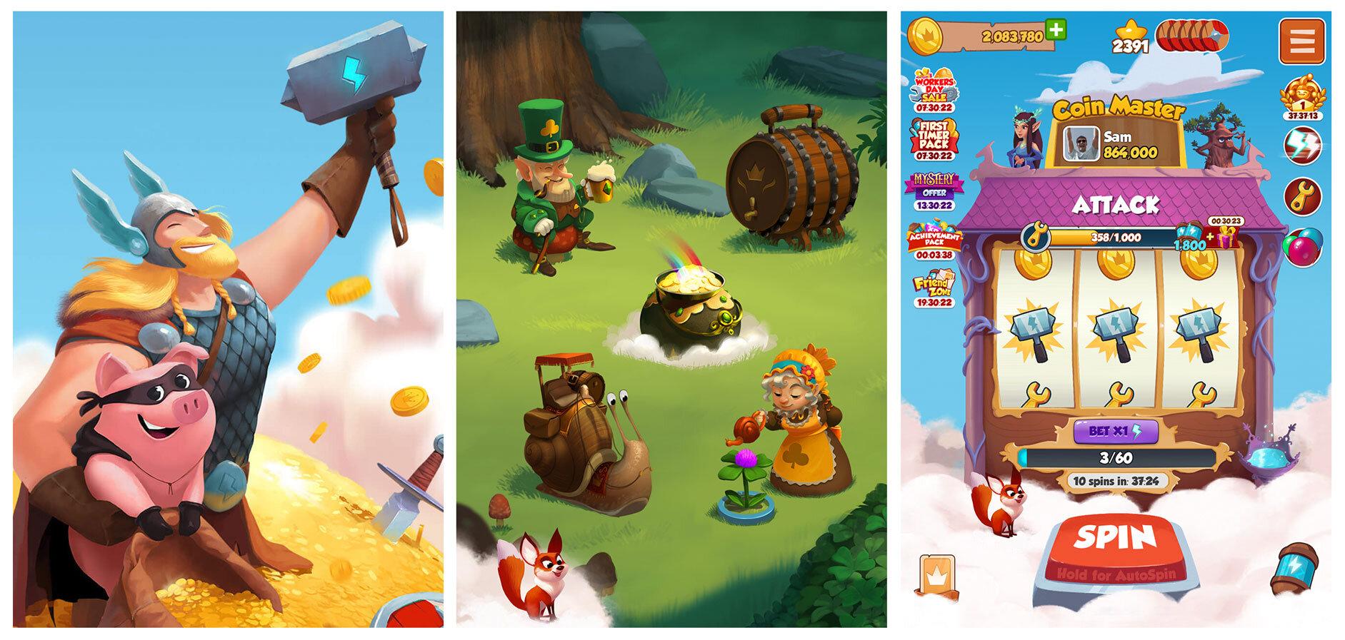
However, the theme still has some origin material: Vikings and pig. The pig is the central character, used as a reel symbol, in the splash, some village items, plus small motifs like the chest lever, etc. And then there’s a Viking themed starting Village, and lightning powered hammer used for Attacks, etc. By the way, Vikings and pigs are not so disconnected. Pigs were common farm animals in the Viking age, and they were Vikings’ favorites for their adaptability to the different environments (changing villages in the game, remember?)
Still do not see a link? Here’s a painting from Norse Mythology showing the connection of a Viking and pig:
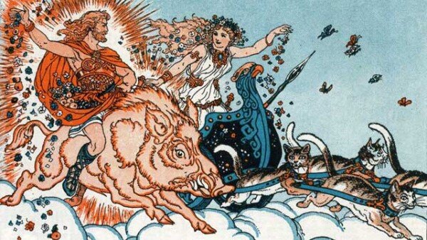
Image source: https://norse-mythology.net/
Or maybe the pig is there to make us associate it with the piggy bank collecting coins? Moving on…
Art Style
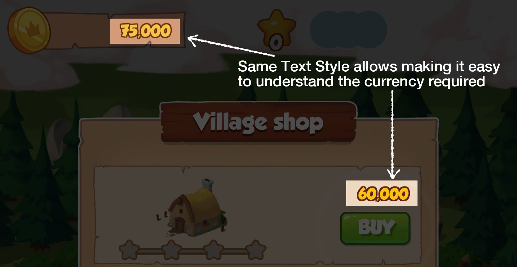
Coin Master’s Art has a soothing visual development artsy look, which is very accessible. Cartoony 2D graphics that avoid getting dark or muddy anywhere. The game has cheerful well-harmonized color palettes, that delivers a soothing look across all villages and screens. Game Assets are softly painted, staying away from strong direct lights or noticeable rim lights (bounce lights are used wherever applicable). This makes everything blend well together, and stay away from noise-causing details. They avoid excessive use of textures, and every texture appearance is simplified and hand-painted. All Art assets are rendered without outlines, except for the reel symbols, which have tinted outlines to make them stand out. All shapes are organically drawn, which hints at the Artistic touch. Yellow gold in the coins is the color that stands out most, which serves its purpose.

I see the roots of this treatment coming from their previous games Super Sam and Wonderball Heroes, which are no longer available on the App Store.

Screenshots of discontinued games ‘Super Sam’ and ‘Wonderball Heroes’ by Moon Active
Worlds
Each village features a unique background that establishes the environment, with five items to build related to the village’s theme. Items are mostly diagonal in orientation and sometimes frontal (usually the top-most asset). Their diagonal arrangement leads the eyes, distinguishing the upgradable assets from the environment.

Village items are staged to focus towards the middle of the screen
A lot of labor has been put in visually progressing each asset that upgrades, ensuring silhouette changes, and functional or decorated improvements every tier. There’s also a unique destroyed state of each item tier, which clearly shows the attention to detail and amount of hard work put in by Moon Active Artists.

Item upgrades bring changes to the silhouette, making the differences noticeable
Besides some hue shifted reuse of trees or smaller rocks/shrubs, I couldn’t find any big reuse example of items from another village. The well-researched selection of asset choices, and their polished treatment (no shortcuts are taken), makes each village look pinning worthy (and it genuinely hurts, when an attacker uses a hammer).

Before/After states of an attacked asset
Village progression map has a classic map styled feel with dotted path and well-illustrated destination stickers. You could scroll and see all the locked future villages map stickers here, confirming a lot of content to new players.

Game Board
The reel board ties up to the theme of your current village. Everything changes visually, from the Payline marker to borders and decoration around the board. Some reel symbols like the pig and coin pouch also adjust to the theme. Ongoing events add some new symbols to the reel. There are no Multi-lines or Wild symbols in the Game board at present. The board’s interface is easy to understand, with a big call-to-action Spin button. The open sky background helps keep the focus on the center area (the subtle outstretched reel around the Payline helps too). The Artists take no shortcuts here again by reusing any village item to ornate the board and instead flex their muscles by making unique ones.
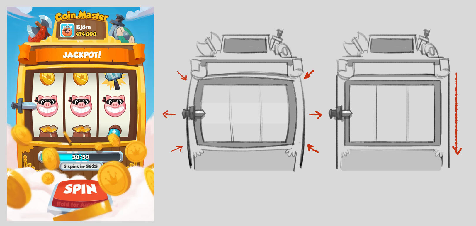
Payline area stretches out to grab attention. Though some later village boards use flat interface
Animations
The animations in the game are a bit of a turn-off for me. They are often too long and do not skip to end when tapped. Oftentimes the linear flow of events feels never-ending (chest unlock leading to progress bar completion leading to reward), and they feel frustrating especially when someone in the meantime raids your village, or when you lose the balloon. Some frames could have been easily cut-down, and animations could end when tapped. When the village is completely shielded, seeing the new shields arrive and get destroyed only to add more spins, feels stretched. I prefer when game animations have easy to understand timings during the FTUE tutorials, but then things speed up between screen transitions for experienced players.